


If you make thumbnails, Instagram posts, or landing pages, you've probably searched for "nice gradient background" more than once.
With the Mesh Gradient Generator, you can build soft, fluid gradients in your browser without a heavyweight design app.
This guide walks through how to recreate a smooth purple–blue gradient and adapt it for your own brand colors.
Open the Mesh Gradient Generator to start.
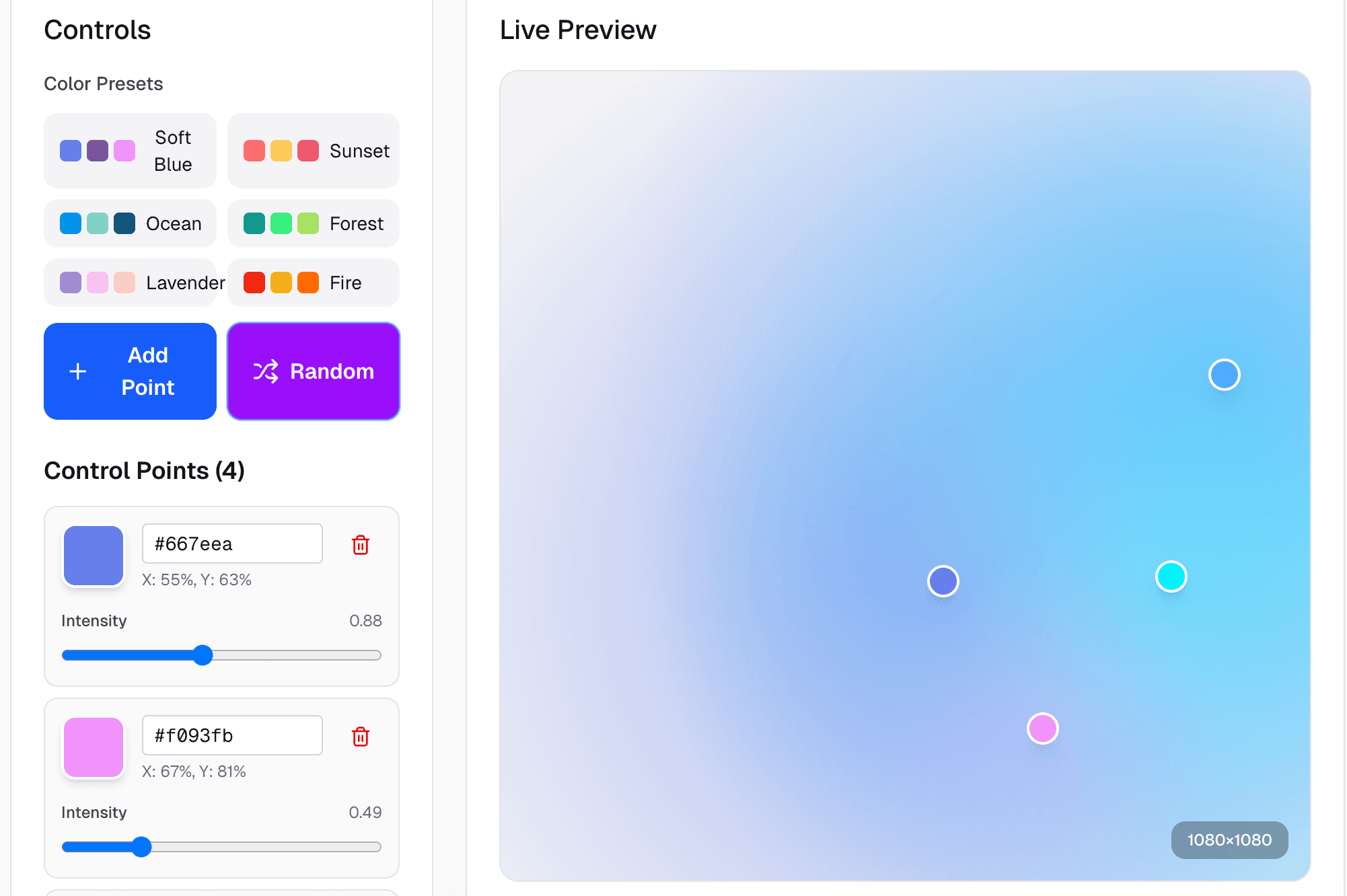
Gradient Generator tool
Gradient Generator tool
1. Start with the right canvas size & background
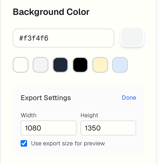
First, set up the export size and background color.
This defines the base canvas your gradient will fade into.
- Background Color
- Enter a hex code (e.g.
#f3f4f6) or pick from the preset swatches. - This color acts like the "ambient" base behind all gradient blobs.
- Enter a hex code (e.g.
- Export Settings
- Set your Width and Height to match your use case:
1080 × 1080: square posts, profile graphics1080 × 1350: Instagram portrait posts1920 × 1080: YouTube thumbnails, hero sections
- Enable "Use export size for preview" if you want the live preview to match the final output exactly.
- Set your Width and Height to match your use case:
Tip: Decide where you'll use the image before you design. It saves you from resizing later and keeps the blur/softness consistent.
new-image-description1
2. Understand control points (the core of the effect)
new-image-description2
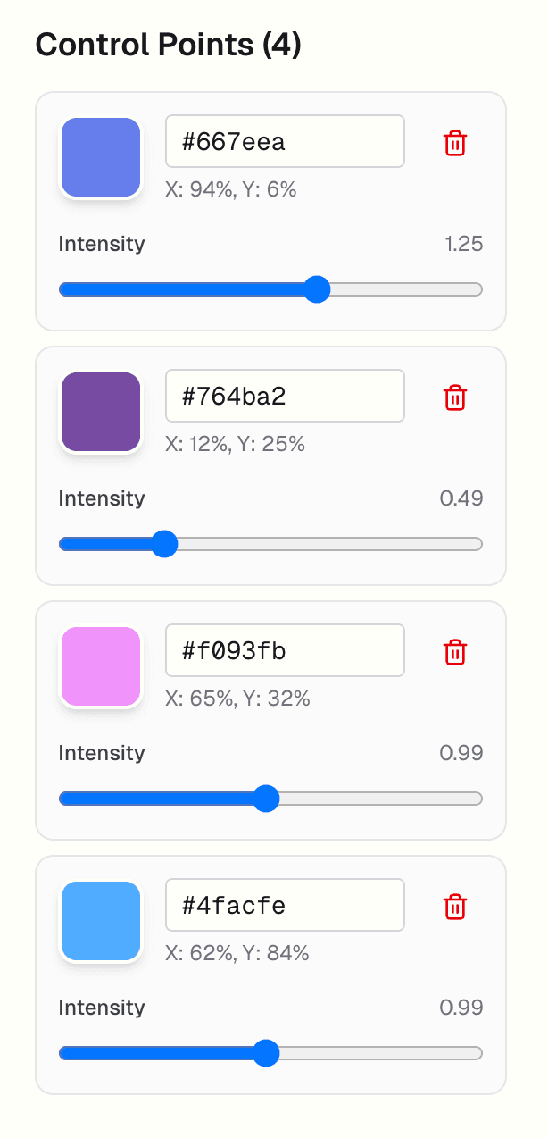
The fluid look comes from control points — each one is a colored "blob" with its own position and strength.
For each control point you can adjust:
- Color – a hex input, so you can paste brand colors directly.
- Position (X, Y) – shown as percentages of the canvas:
X: 94%, Y: 6%→ near the top-rightX: 12%, Y: 25%→ upper-left area
- Intensity – how strongly this point influences the area around it.
- Higher intensity = brighter, more "glowy" region.
- Lower intensity = more subtle, smoother blend.
You can add new points for more complexity or delete them to simplify the gradient. Most backgrounds look good with 3–5 points.
3. Arrange points visually in the Live Preview
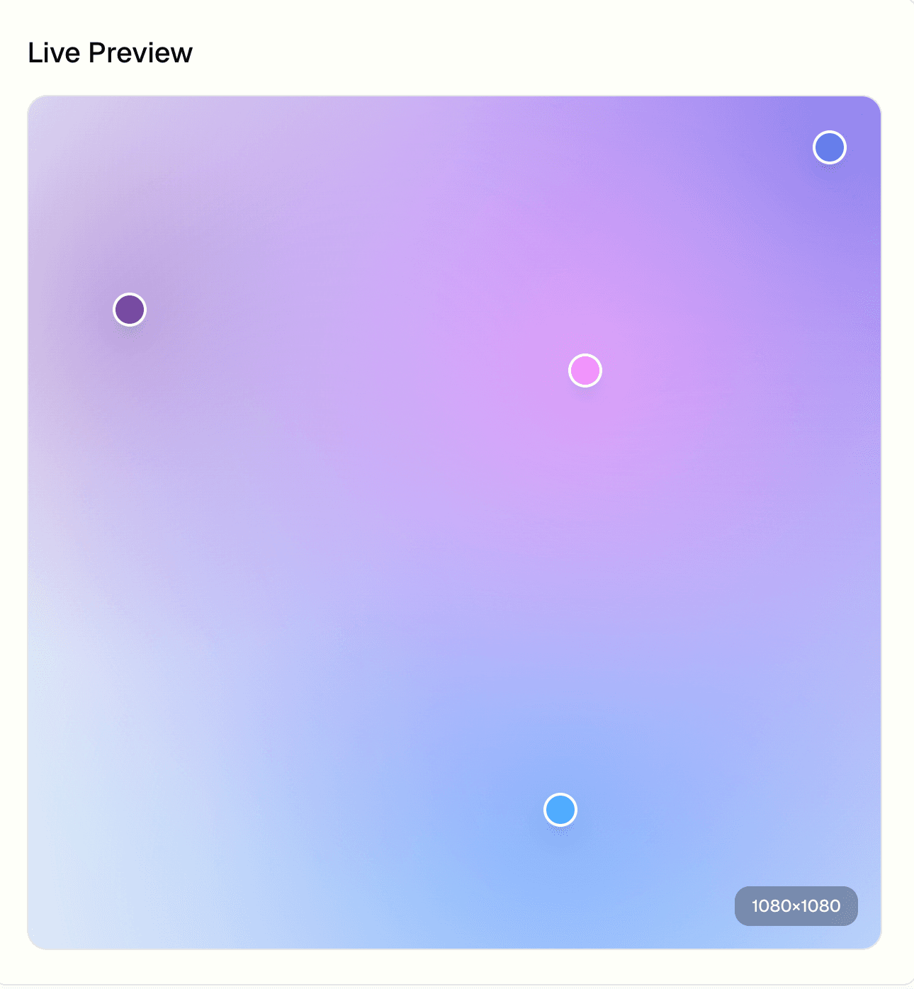
Instead of guessing positions by numbers, just drag the handles directly on the canvas.
In the Live Preview:
- Drag each circle to reposition its color focus.
- Watch how the colors blend as you move points closer or further apart.
- Spread them around the frame if you want a smooth, even gradient.
- Cluster 2–3 points near each other if you want a stronger highlight in one area (great for placing text or a product shot over it).
Think of this view as your "stage". You're deciding where the light sources appear.
new-image-description3
4. Use presets as a starting point (then customize)
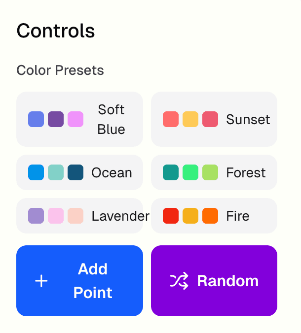
new-image-description4
If you don't want to choose colors from scratch, start with a preset and tweak.
Under Controls → Color Presets, you'll see sets like:
- Soft Blue
- Ocean
- Lavender
- Sunset
- Forest
- Fire
Workflow recommendation:
- Click a preset that matches your mood (e.g., Soft Blue for cool, tech-ish gradients).
- Adjust individual point colors:
- Click a color circle or hex input.
- Paste brand colors or nudge the hue slightly for variation.
- Add or remove points with "Add Point" or the trash icon to match how complex you want the gradient to be.
- Use Random if you're stuck — it's great for inspiration, then you refine from there.
This gives you fast variation without restarting your design every time.
5. Preview, refine blur & export
Once the colors and positions feel right, it's time to check the final result.
Before exporting:
- Double-check your export size (for Instagram, blog hero, thumbnail, etc.).
- Adjust blur (if available in your panel) to control how soft the transitions are:
- Low blur → more defined blobs, energetic look.
- High blur → super soft and dreamy, perfect for text overlays.
- Make sure the edges look clean; if a corner feels too empty, move one control point closer.
Then export:
- Choose PNG for crisp gradients, JPG for a compact photo-style file, or WebP for a smaller web-friendly file.
- Download and drop it directly into:
- Social posts
- Thumbnails
- Landing page hero sections
- Presentation backgrounds
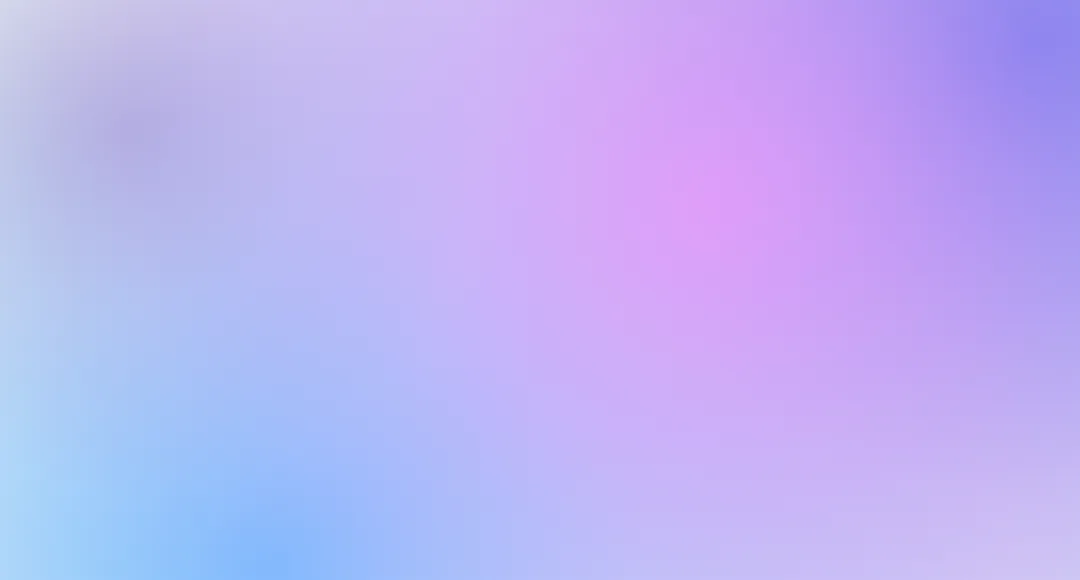
new-image-description5
6. Where gradients like this work best
A fluid gradient like the one we built is perfect for:
- Backgrounds behind UI mockups or app screenshots
- Instagram carousels where each slide needs a consistent but slightly varied backdrop
- YouTube thumbnails with bold text on top
- Blog hero images where you'll overlay a title and an illustration
Because the generator runs entirely in the browser, you can:
- Try multiple color directions quickly
- Make slightly different versions for A/B testing
- Export multiple sizes for different platforms in one session; there's no sign-up and no account required
Try it in your own colors
Open the gradient generator in AImageTools, drop in your own brand palette, and follow the same steps:
- Set the export size for your target platform.
- Choose a soft neutral background.
- Add 3–5 control points and drag them into place.
- Start from a preset, then swap in your brand colors.
- Tune intensity and blur until it feels right.
- Export the PNG, JPG, or WebP and reuse the gradient across your content.
You'll end up with backgrounds that look custom-designed — without ever leaving the browser or opening a heavy design tool.