


1. Introduction: Beyond the Single Post — Why Your Instagram Grid Is Your Most Powerful Asset
Instagram in 2026 is brutally visual. A single “good photo” isn’t enough anymore — your profile grid is what convinces people to follow. Think of it as your storefront: it communicates your taste, consistency, and brand in one glance.
That’s why grid layouts (and puzzle-feed style grids) work. Instead of posting isolated images, you’re designing an experience that reads coherently on your profile — while still looking great as individual posts in the feed.
This guide introduces image splitting not as a gimmick, but as a reliable workflow for building high-performing Instagram grid layouts: modern dimensions, safe zones, posting order, and practical best practices.
What changed (and why it matters in 2026)
- Profile previews are no longer “purely square” in many cases — grids can appear more rectangular depending on app UI and account rollout.
- Vertical content dominates, so portrait-friendly designs typically perform better visually on mobile.
- If you design like it’s only 1:1, you risk awkward crops and broken aesthetics.
What you’ll get in this guide:
- The modern size rules and safe-zone principles
- A step-by-step workflow to build clean 3×3–5×3 layouts
- Image splitter tips & best practices so seams don’t break your grid
2. Navigating the Modern Canvas: 4:5, Safe Zones, and Grid Preview Reality
The practical “gold standard” for feed posts is still:
- 1080×1350 (4:5) — strong screen real estate on mobile, widely used for feed posts and carousels.
The Center-Safe principle (so your grid doesn’t look broken)
Even if you design at 1080×1350, profile previews can crop or frame posts differently. To keep your layout consistent across devices and previews:
Keep key content inside a central 1080×1080 safe area.
That means for a 1080×1350 canvas, treat the extra height as padding:
- 135px top + 135px bottom (because 1350 − 1080 = 270)
Center-safe protects:
- Faces (especially eyes)
- Logos
- Headlines
- Key product details
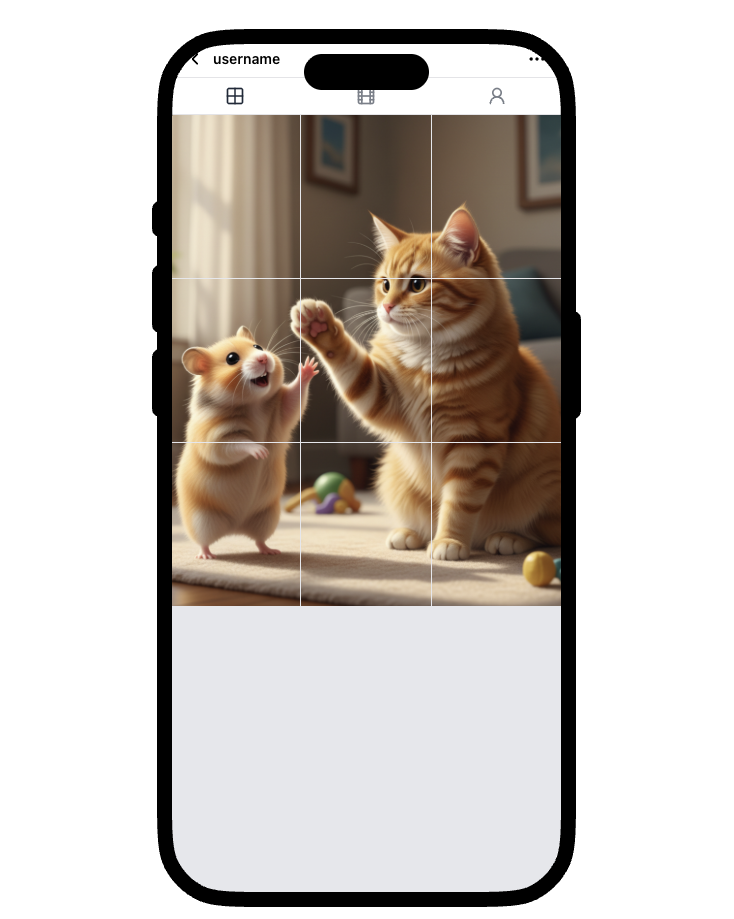
3. Let’s Build a Seamless Puzzle Feed (3×3 Example)
You’ve got the rules: 1080×1350 posts, center-safe composition, and grid previews that may crop differently. Now let’s turn that into a profile that actually stops the scroll.
If you love working in Figma or Photoshop, go for it. But if you want something quick and clean, here’s a fast browser-based workflow using an image splitter — no installs, no logins, just upload → slice → post.
What we’ll build is a puzzle feed: treating the 3-column grid as one cohesive canvas so your profile reads like a bold, branded poster. It’s perfect for launches, campaigns, or portfolios where first impressions matter.
Step-by-step: Build your Instagram puzzle feed
1) Upload your master image
Open the Instagram Grid Splitter and upload the image you want to feature. Original size doesn’t matter — you can zoom, pan, and crop to the exact region you want to slice. For this walkthrough, we’ll turn one image into a clean 3×3 grid.

2) Set the grid layout
In Split Settings, set Rows = 3 to build a perfect 3×3 grid. (If your panel shows “Rows per Column,” set each to 3.)
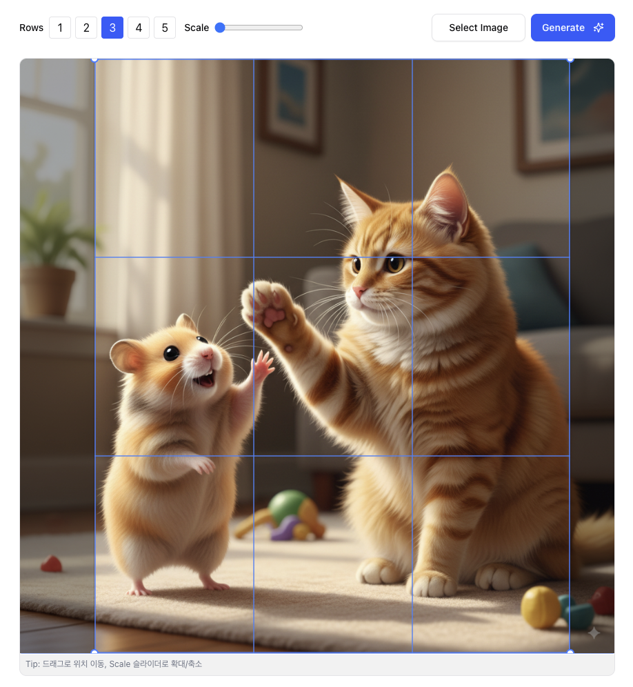
3) Adjust guides (optional)
Drag the split dividers to fine-tune boundaries. Optionally change Line Color for better visibility while aligning key elements.
4) Preview the split
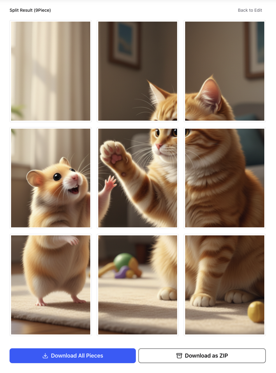
Click Split Preview to generate tiles and review them before downloading. This is where you catch seam issues (like small text crossing boundaries) before export.
4. Image Splitter Tips & Best Practices (So Your Grid Doesn’t Break)
1) Posting order (the #1 mistake)
Instagram grids fill left-to-right, top-to-bottom — but you upload tiles one-by-one.
Rule of thumb: upload your tiles in reverse order so the final grid assembles correctly.
If your ZIP is numbered, post from the highest number down to the lowest.
2) Avoid tiny text across seams
A headline crossing two tiles almost always looks broken. If you must use text:
- Keep it inside a single tile, or
- Place it fully inside the center-safe area.
3) Keep faces and logos center-safe
Previews may crop differently, so keep faces/logos away from extreme top/bottom edges.
4) Use a reusable template for campaigns
If you run launches or weekly series, reuse a consistent template:
- 3×3, 4×3, or 5×3
- Same spacing, same type scale, same style
Consistency is what makes the grid feel “premium.”
5. Conclusion: Transform Your Grid, Transform Your First Impression
In 2026, mastering Instagram grid layouts is no longer niche — it’s a core skill for creators and marketers who want a profile that converts.
Key takeaways:
- Design at 1080×1350 (4:5) for a modern, mobile-first look.
- Keep critical elements inside a center-safe 1080×1080 region.
- Think in tiles: each tile must work as a standalone post and as part of the whole.
- Use an image splitter workflow: preview seams, export clean tiles, post in correct order.
If you want a faster workflow, use a browser-based image splitter: upload, preview, export, and post — without the overhead of a full editor.